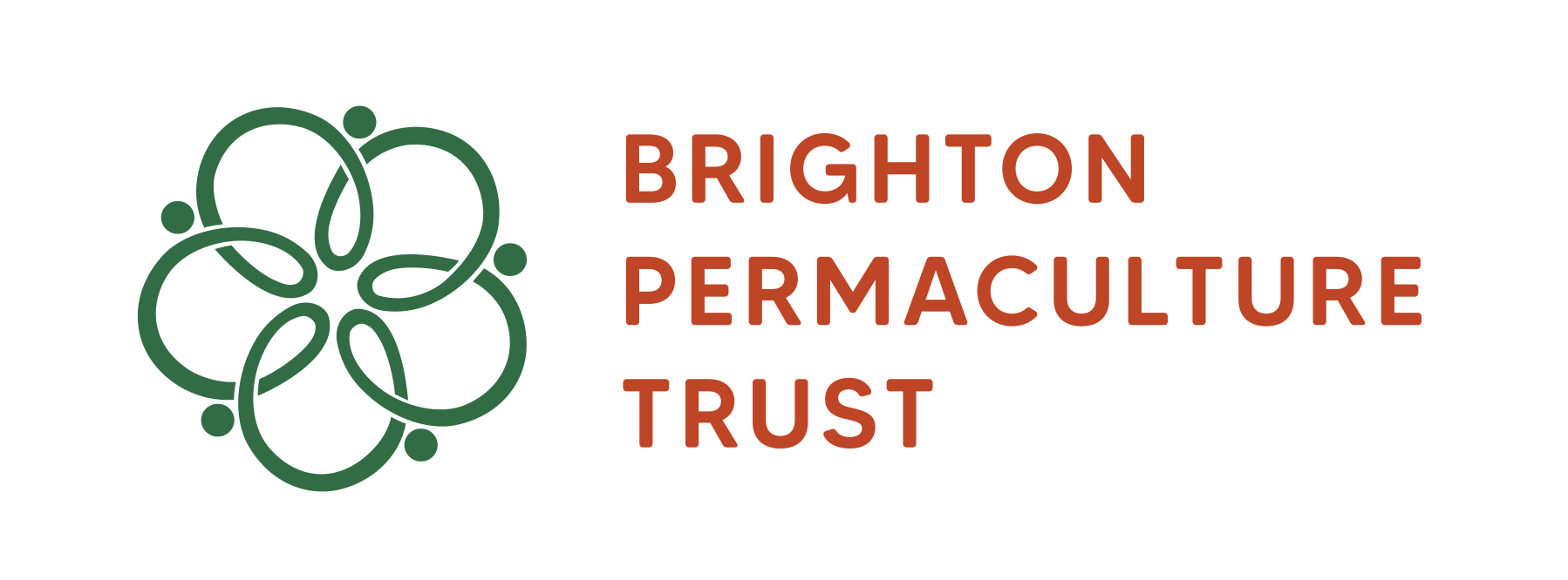
This logo took it’s inspiration from the journey of Brighton Permaculture Trust. The original logo was a young sapling, made in the early 2000’s it was indicative of the organisation at the time, emerging. 20 years on the organisation has grown. This new logo reflects the journey.
Taken from the inspiration of the centre of an apple, after the organisations many orchards, the logo reflects the structure and evolution of the organisation.

At the centre of the logo you will find the seeds, which are still being planted in Brighton Permaculture Trust’s daily work. These seeds are found at ‘the core’, the name of the central organising team with the petals forming the teams that support and lead the work of different parts of the organisation. The volunteers who support the work are found round the edges of the design, interlinking and working together. The heads of the people are also representative of pollen, as the organisation has flowered, running it’s own courses and projects, which are now inspiring and pollinating many others.
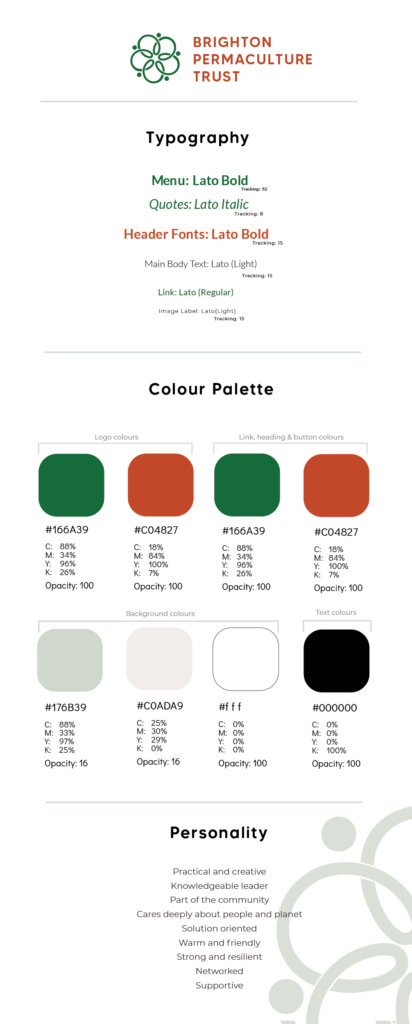
I also designed the stylesheet and outline of the branding voice for the website and communications. Using the structure of their current design, to keep costs down, I updated the colours, styles and fonts to fit with the new branding. The logo, style and voice were developed after a series of group consultations with Brighton Permaculture Staff, Trustees and volunteers.